Dashboard Templates, Charts, Graphs & Reports for Jira
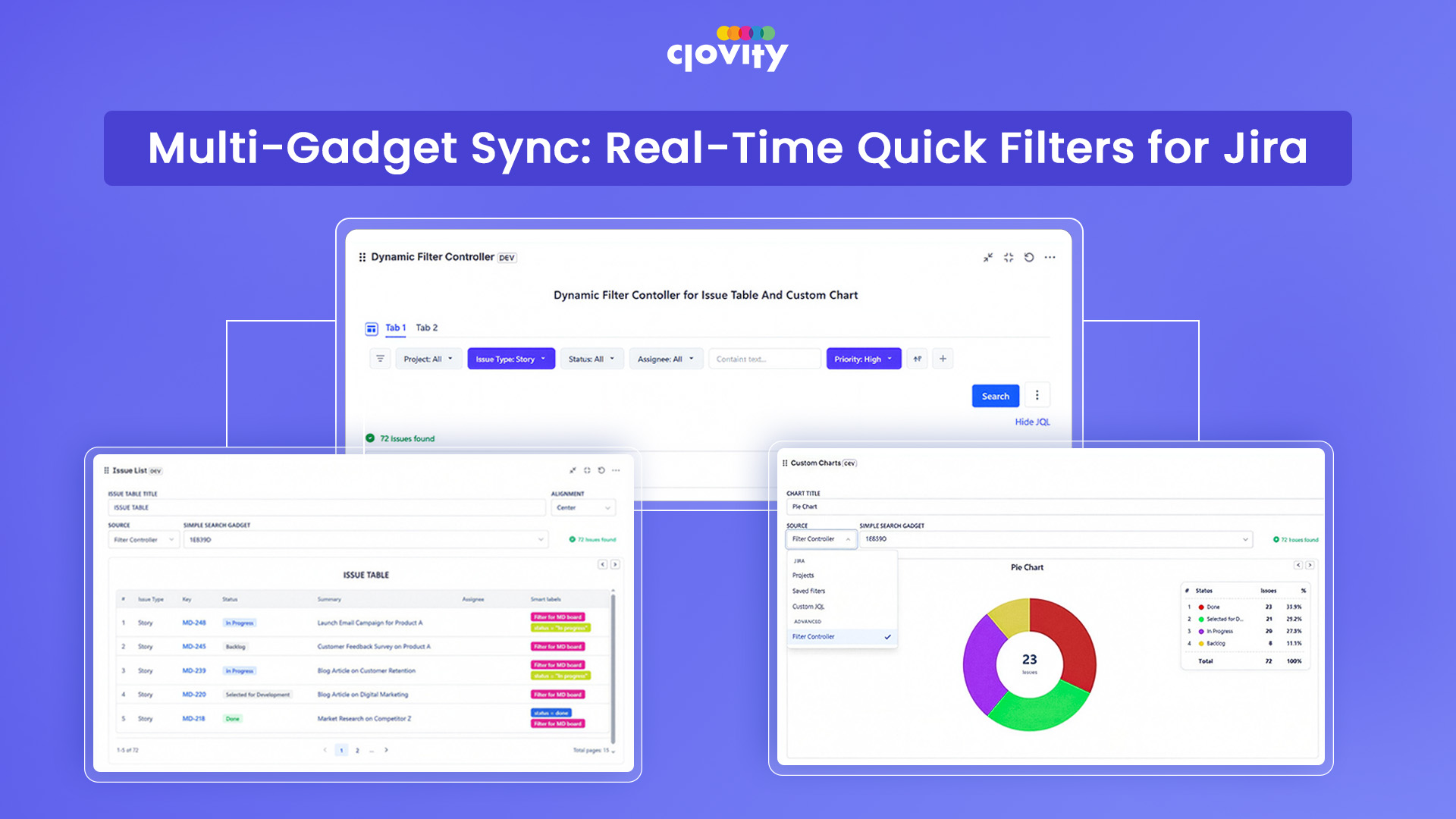
Dashboard Templates, Charts, Graphs & Reports for Jira is a Forge-native app that brings nine powerful reporting gadgets directly to your Jira dashboard. It covers live charts, issue tables, sprint burndowns, cycle time tracking, and time-in-status analysis - all without leaving Jira. Every gadget runs on JQL so data is always current. A built-in Filter Controller lets a single filter update every gadget on the dashboard at once.
Replaces multiple separate plugins with one app - one install covers charts, tables, agile metrics, and reporting
Data never leaves Atlassian - no external servers, no third-party storage, fully Forge-native
One search bar drives every gadget simultaneously - change a filter once, every chart and table updates instantly
Configs are exportable as JSON - duplicate and share dashboard setups across teams in seconds
Step 2 of 6
Custom Chart Gadget
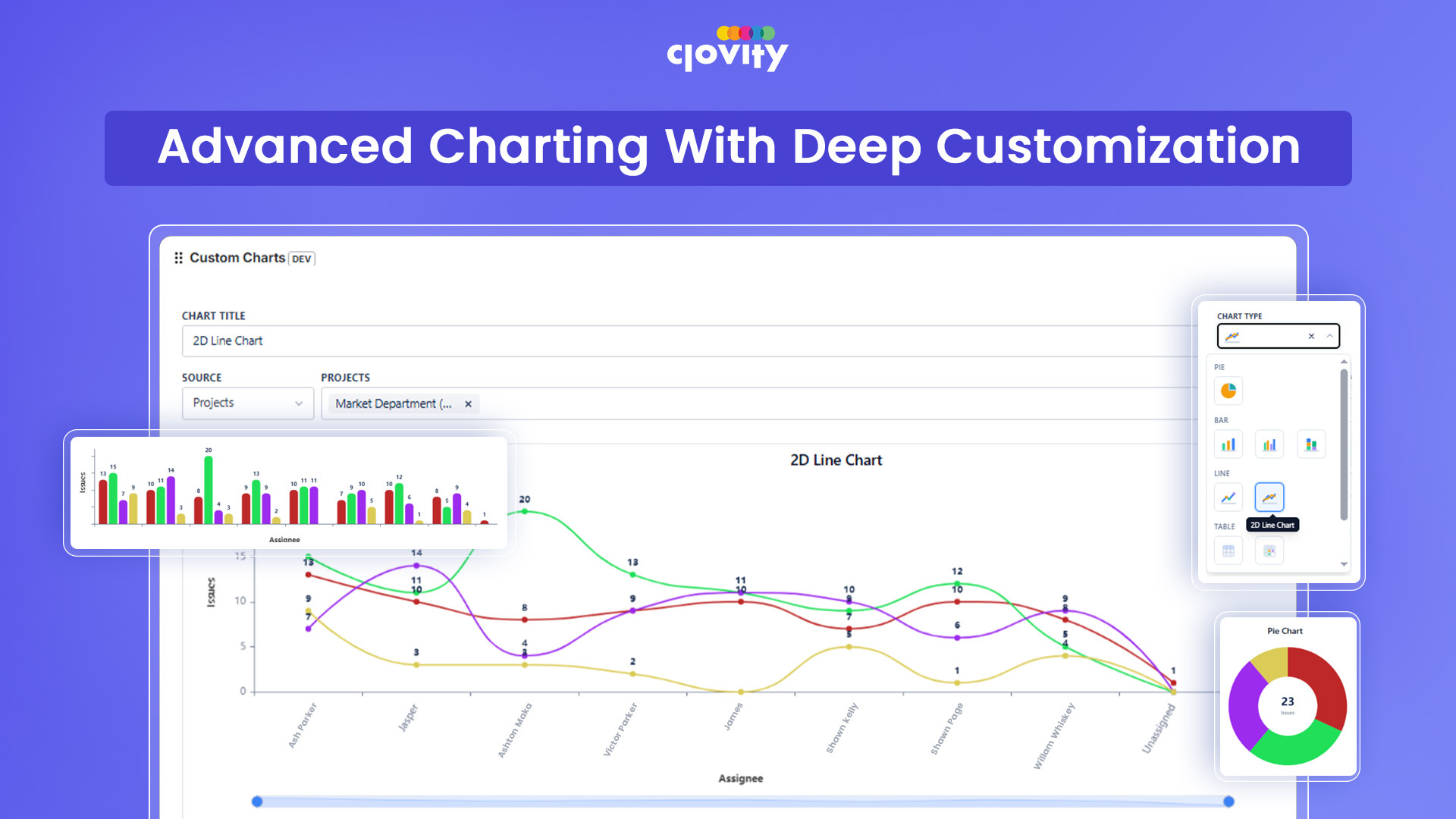
The Custom Chart gadget turns any JQL query into a visual chart - Bar, Line, Pie, Donut, Scatter, Heatmap, Radar, and more - built on Apache ECharts. Pick your data source, choose your fields, and the chart builds itself. Colors, titles, and groupings are fully configurable. Configs save and export as JSON so charts can be shared or reused across teams instantly.
9 chart types in one gadget - covers executive summaries, trend analysis, and risk mapping without switching tools
Fully customizable - per-series colors, title templates, and field groupings without writing any code
Import/export in one click - share a working chart config with another team in under a minute
Step 3 of 6
Issue List Gadget
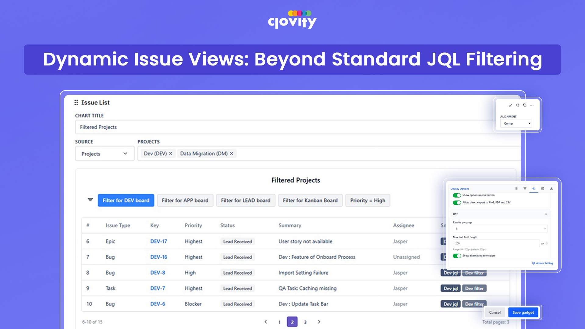
The Issue List gadget displays any JQL result as a clean, paginated table directly on your Jira dashboard. Choose which columns to show, sort by any field, and click any row to open the issue directly. It works with project filters, saved filters, or raw JQL and responds to the shared Simple Search bar so it updates alongside every other gadget on the dashboard.
Fully configurable columns - show exactly the fields your team needs, nothing more
Click-through to any issue - go from dashboard overview to issue detail in one click, no separate search needed
CSV export on demand - get a shareable report from any JQL scope without leaving the dashboard
Syncs with Filter Controller - one filter change updates the table and every other gadget simultaneously
Step 4 of 6
Time in Status Analytics Gadget
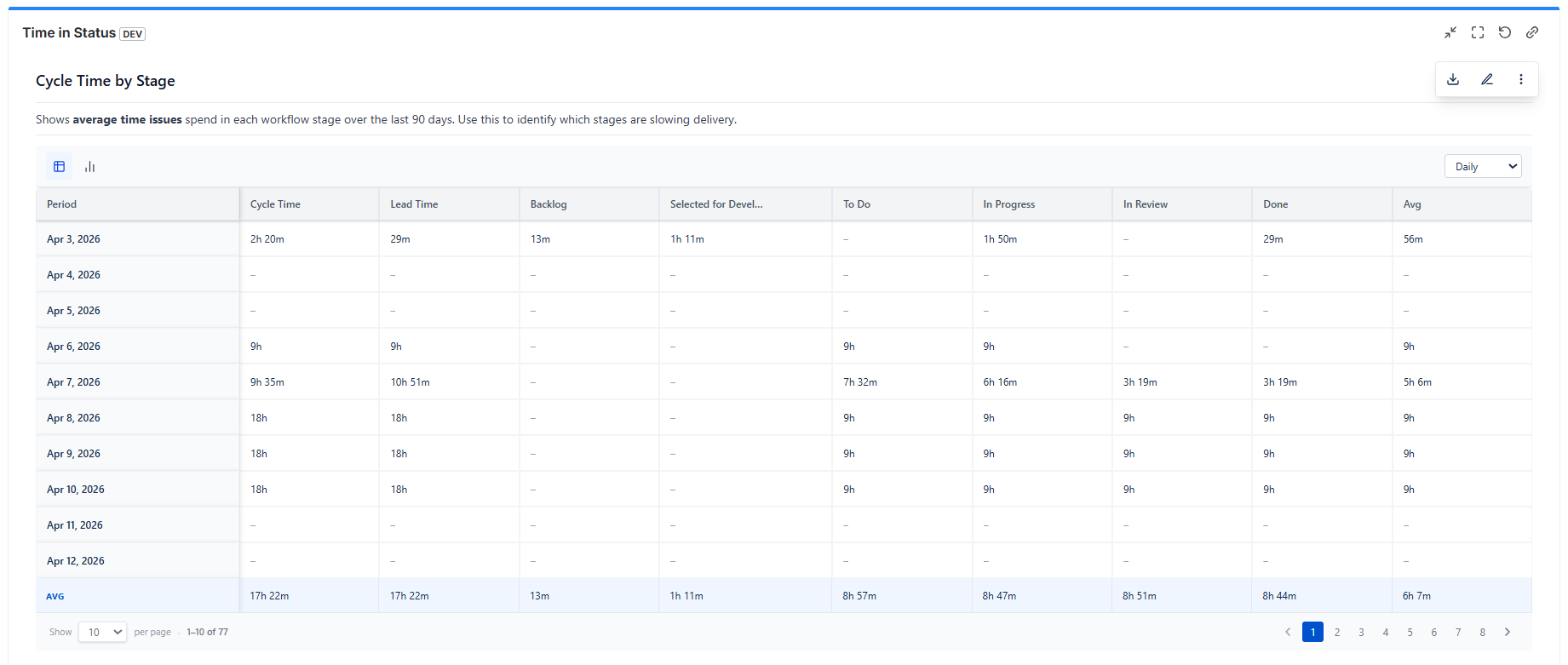
The Time in Status gadget shows exactly how long issues spend in each Jira workflow status. Group related statuses into phases like "In Review" or "Blocked," and the gadget calculates time spent per phase per issue. Work schedules exclude weekends and holidays so durations reflect real working hours. Results are viewable as a table or chart, with a data feed available for external BI tools.
Pinpoints bottlenecks instantly - see which status is slowing delivery across all your issues
Work-schedule aware - durations exclude weekends and holidays, so the numbers reflect actual team capacity
Status grouping - combine multiple statuses into meaningful phases instead of counting raw transitions
Step 5 of 6
Control Chart Gadget (Cycle Time Analytics)
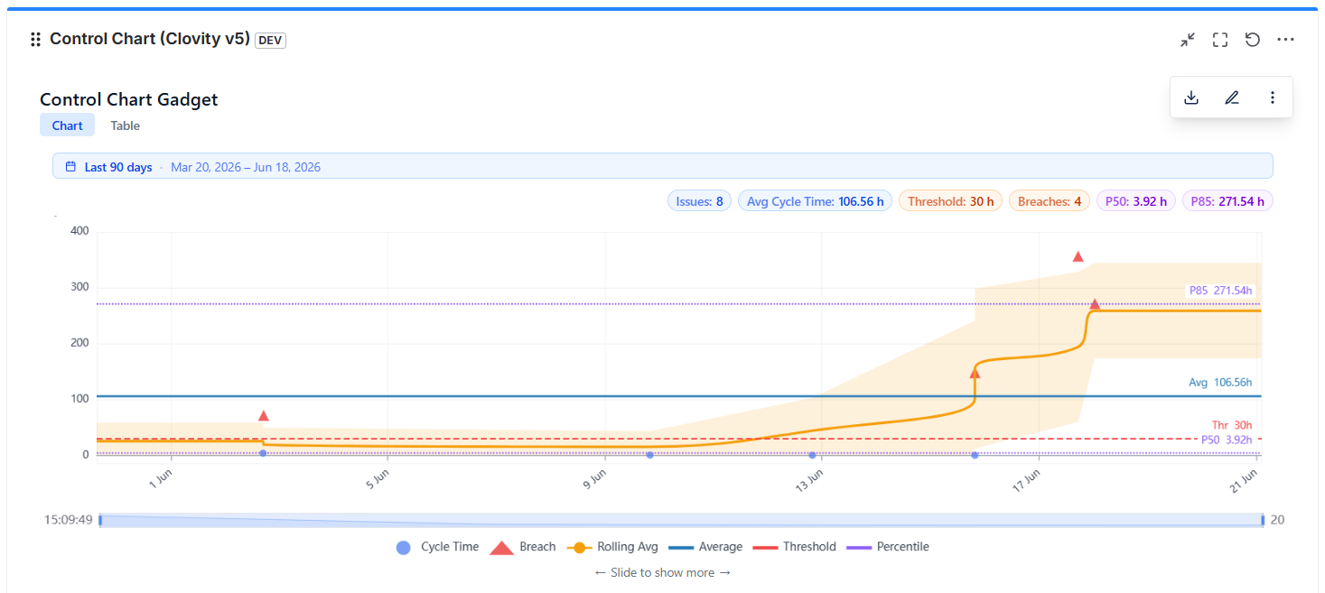
The Control Chart gadget measures how long issues take to complete - from start to done - and plots each one against statistical control limits. Outliers are flagged automatically so teams can separate normal variation from real process problems. Scope by board, sprint, or version. Work-hour adjustments keep the data honest. A rolling average line shows whether cycle time is improving or getting worse over time.
Control limits tell you what's normal vs. broken stop treating every slow issue as a crisis
Flexible scope - analyze by board, sprint, or release without reconfiguring the gadget
No manual input - cycle time is computed directly from Jira changelog data automatically
Trend line shows direction - know whether your team's delivery speed is improving sprint over sprint
Step 6 of 6
Sprint Burndown Chart Gadget
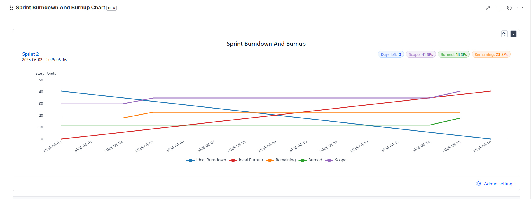
The Sprint Burndown gadget plots remaining sprint work against the ideal burndown line, giving Scrum teams an instant read on whether the sprint is on track. Pick a board and sprint - the gadget pulls live data from the Jira Agile API and draws the actual burndown curve including scope changes. Switch between story points or issue count. A scope change overlay shows exactly when and how much work was added or removed mid-sprint.
Scope change overlay - see if velocity looks good because the team delivered or because scope was cut
Auto-populates sprints - select a board and the active sprint loads immediately, setup takes seconds
Story points or issue count - works for any team regardless of estimation style